Unit 3: The Communications Package
3.2: Leveraging Principles of Visual Literacy
Translating Ideas into Images
At this point, once the strategic planning for the communications package is done and the intent, audience, and message of each communication item have been determined, it’s time to focus on the actual development of the different communication pieces.
This section introduces the idea of multimodal communication as an element of engaging storytelling. It then continues to introduce a set of techniques for leveraging strong visual literacy skills in the development of an infographic or other visual-dominant forms of communication.
Introduction to Multimodal Communication
The goal for this section is to appreciate and explore how the forms of our storytelling have a transformational impact on the content. Different forms of media can be used, leveraging their unique potential to shape, persuade, and engage an audience’s appreciation of your core messages.
READ
-
Watch Joe Sabia’s 2011 TED Talk The Technology of Storytelling.
The Technology of Storytelling [3:34]
(Sabia, 2011) CC BY-NC-ND 4.0
This is 3 minutes of fun, but also should get you thinking about the importance of audience engagement in your story and how you can use the media you have to achieve it.
-
Read Ann Fillmore’s (2016) lesson on “Multimodal Communication.”
LESSON
In the context of strategic communication, the question of how we tell our story, or communicate our core messages, is intricately connected to audience and goal, as we have been exploring. We can think carefully about how our choice and use of different modalities shapes how we tell these stories.
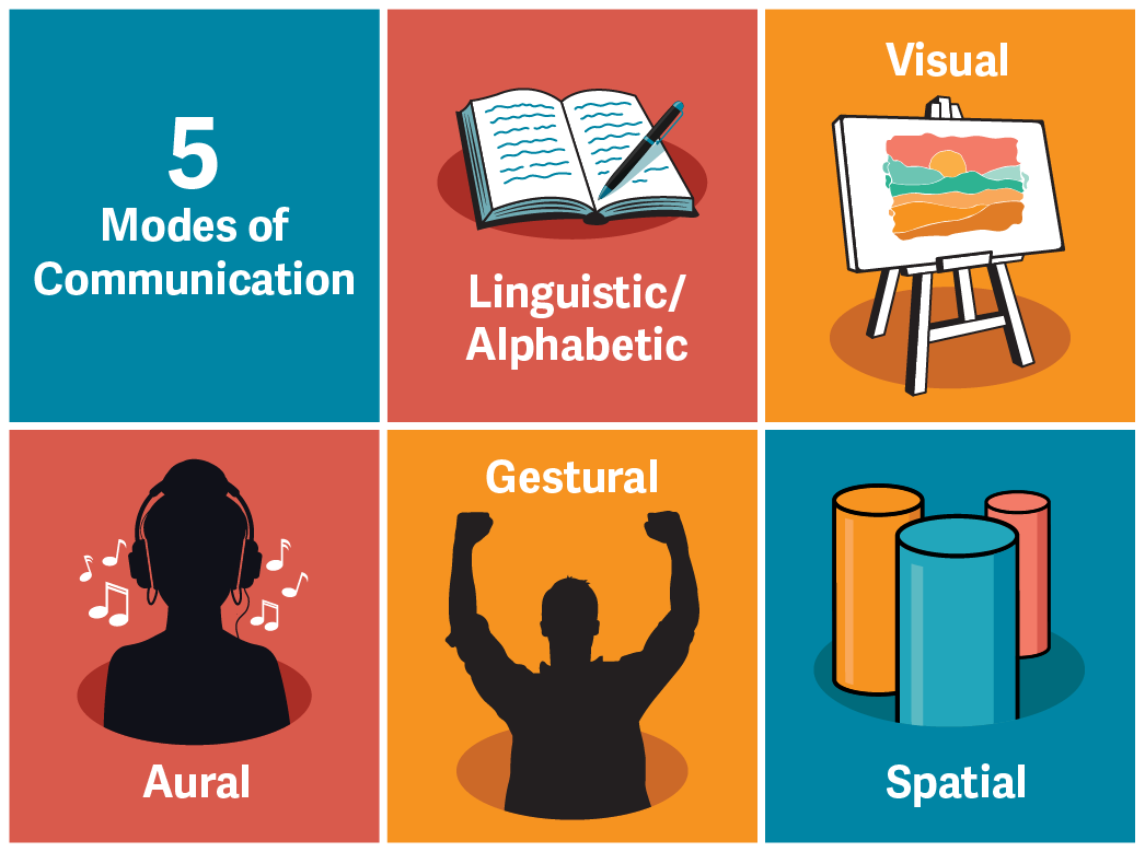
Audiences often prefer to receive different kinds of information through different modalities. Consider for a moment your own preferences. How do you prefer to get your news? How about learning new information? What about for entertainment?
-
Video (watch/listen)
-
Newspapers/books/articles (read)
-
Radio/podcast/lecture (listen)
-
News feeds/social media/websites (scan multimodal)
How does it feel when you have to receive information in a mode that just feels wrong for the content? Ask other people in your life, including people of other generations or other areas of professional interest, these same questions. Are there different preferences?
So, from the producer’s point of view, selecting modality is a rhetorical decision, made to achieve the intended goal of the communication for the intended audiences. News today is available across a wide range of modalities to ensure the broadest possible audience, but how that news is presented varies significantly by modality, responsive to its unique features. Take a moment to track a recent news story across a newspaper, television news broadcast, and social media; how is the story shaped differently across these modalities?
Multimodal communication strategies aim to reach a broader audience not only by sending a message across multiple modalities, but also sometimes by combining modalities to make an experience richer. Consider, for example, the intersections between popular entertainment on a streaming service and the associated social media coverage inviting interactive fan participation.
When making rhetorical decisions about modality, we can consider these following tips:
-
Know the communication strengths of each mode and match to intent, audience, and message. If you know you are doing an infographic, make decisions about intent, audience, and message that align well with that mode.
-
Know the features and restrictions of any platform for communication (print, web, audio, etc.) and accommodate for them.
-
Explore options to combine modes to amplify communicative effect.
-
Ensure each mode used adds meaning and value; avoid gratuitous use of multimodal communication if it doesn’t add something.
-
Assess your own communicative competency. Do you have the resources and skills to use the mode effectively?
Leveraging Visual Literacy
READ
-
Watch Christoph Niemann’s (2018) TED Talk You Are Fluent in This Language (and Don’t Even Know It).
You Are Fluent in This Language (and Don’t Even Know It) [12:32]
(Niemann, 2018) CC BY-NC-ND 4.0
-
Now read the short essay by Dahliani Reynolds (2020) on “Visual Rhetoric.”
LESSON
As Niemann suggests in his talk, this cultural moment is characterized by strong visual literacy skills. Our media environment is saturated with visual information, and we are increasingly able to act as visual producers, using a range of digital tools, in ways that were not always possible in an earlier media era. Visual expression is now a normative part of our daily communication.
This literacy is a strong foundation on which to think carefully about how we use the visual mode to achieve professional and strategic communication challenges. We can begin to think about achieving our core messages across the range of modes, which requires us to consider, as noted in the readings, the unique contributions of each mode.
The use of visuals for communication, or visual rhetoric, requires the same care and attention to content, tone, and style as we would need with words. When using visuals to communicate and create meaning, we must be attentive to the cultural resonances of our visual rhetoric as well as the register or tone (formal or informal, for example). Visuals communicate quickly and often with a lot of direct impact, so nuance can be more challenging than when using words; in this sense, be mindful of the messages, both implicit and explicit, being communicated through image selection.
Using Visual Tools Effectively for an Infographic Style Document
READ
Think of these readings as a best-practice toolkit for the development of an infographic, or similar kinds of visually dominant communications. Put this toolkit to good use:
-
Skim through the readings to get an overall picture of the skills and techniques covered.
-
Refer back to specific sections in designing and developing the infographic for your communications package.
-
Use the principles in this toolkit as a guide for the overall quality and effectiveness of your document.
Readings:
-
“How to Make an Infographic in 5 Easy Steps” (Velarde, 2025)
-
“Infographic Copy 101: How to Write an Infographic That’s Easy to Understand” (Memon, 2021)
-
“What Makes a Good Infographic?” (Hooper, 2025)
In completing the communication planning for the infographic, strategic decisions can be made in the context of the communicative potential of this mechanism. Infographics or other visual-heavy fact sheets lend themselves well to quick and efficient consumption of information, usually a simple or really focused idea or core message. They are less suitable for a complex situation that requires persuasion for audience engagement.
Unit Task 7: Leveraging Visual Communication (2% of course grade)
UNIT TASK 7
To practise thinking strategically about the use of visual communication, and to get familiar with the best-practice techniques for developing infographics, your task is to analyze and compare three sample infographics.
Alas, while there are some good elements in these samples, each of these infographics has some problems in design and overall effectiveness. By filling in the table provided, please evaluate the different aspects of each infographic, indicating whether it is effective or not, and why.
Sample 1—Health Benefits of Coffee vs. Tea (Jackson, 2015)
Sample 2—Benefits of Drinking Tea (Suja Organic, 2014)
Sample 3—Health Benefits of Drinking Coffee (The Star, 2025)
Unit Task 7 will be graded on a scale of 1% for attempt, 1.5% for evidence of inclusion of course material, or 2% for thoughtful engagement/interaction with the course material.
Please submit your Unit Tasks 6, 7, and 8 as one document at the end of Unit 3.
Effective? Yes/No and Why
Effective? Yes/No and Why
|
Aspect |
Sample 1 |
Sample 2 |
Sample 3 |
|---|---|---|---|
|
Title: Is it catchy with a clear indication of the topic? |
|||
|
Introduction: Concise summary of what we get in the infographic? |
|||
|
Sources: If used, listed clearly at bottom? |
|||
|
Structure: Effective structure to match the story they want to tell? Is the relationship between the chunks of information clear? |
|||
|
Content: A clear scope and message? A manageable amount of information for the form? Achieves its goal? |
|||
|
Text/Visual Balance: Text is used appropriately to enhance the visual story, not for new info? |
|||
|
Visual Choices: Selection of visual devices (icons, images, charts, graphs, colour, etc.) makes sense and leads to increased clarity and transparency of information? |