Module 4 Book: Designing PowerPoint Presentations for All
Alignment
“Nothing should be placed on the page arbitrarily. Every element should have some visual connection with another element on the page."
(Williams, 1994, p. 14)
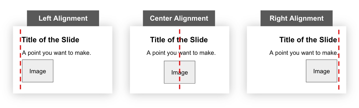
Humans like to see order as it creates a calm, secure feeling (Williams, 1994, p. 35). Nothing should be arbitrarily placed on a slide without purposeful consideration. To create a sense of order in your slide design, three common types of alignment are:
-
Left
-
Center
-
Right
When designing PowerPoint slides, choose one alignment (left is most common) and use that consistently throughout the presentation for a unified look. However, contrasting alignment styles can result in interesting combinations when applied strategically!
Further, when placing elements on a slide, ensure each one visually aligns with other items on the slide. For example, you may consider aligning the:
-
Top or bottom edges
-
Left or right edges
The examples below contain red dashed lines that are helpful to imagine when visually aligning elements on a slide.
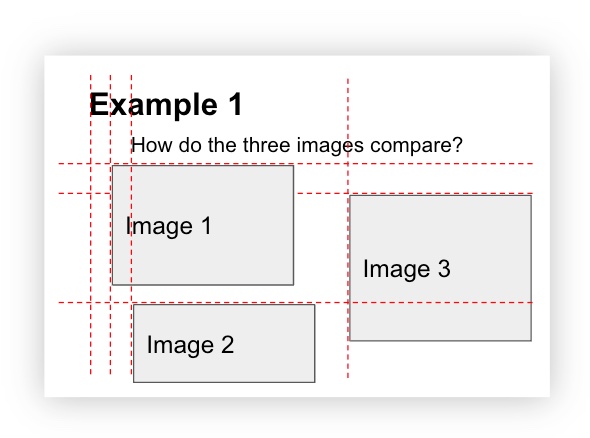
The following slide design has multiple elements that are not aligned which makes the slide feel chaotic:
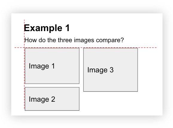
Now, by simply aligning the left and top edges of the elements, and creating consistent spacing between the images, this next slide feels much more cohesive and stable:
Grid
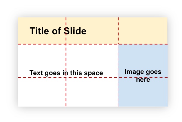
When organizing multiple elements on a slide, using a grid is helpful. A grid divides a slide into columns and rows, in equal or unequal sections, like the red dashed lines below. Then, the slide elements (titles, images, text, etc.) are designed to sit across these columns and rows in various combinations. Using a grid, like the one below, helps to organize your content in clear, defined areas which creates a sense of balance (Goring, 2022).
As an example of how a grid can transform into a slide design, the grid above was used to create the following slide:
Alignment Activity
Look at the slide below and think about where you would envision grid lines. Then, drag the white vertical bar to the right to make some dominant grid lines appear. Did they match the ones you were imagining?
(Refresh your screen if the window below is displaying small)