Module 4 Book: Designing PowerPoint Presentations for All
| Site: | TRU Open Courses |
| Course: | Inclusive Digital Design Course (Enrolment Key: IDD) |
| Book: | Module 4 Book: Designing PowerPoint Presentations for All |
| Printed by: | Guest user |
| Date: | Tuesday, 14 July 2026, 1:02 AM |
Module 4 Overview
Learning Outcomes
-
Identify slide design strategies that enhance learning for all
-
Explain how slide design practices impact the student learning experience
Topics
-
Topic 1: How the brain processes visual and verbal information
-
Topic 2: Designing your presentation (the basics)
-
Topic 3: Designing your presentation to promote learning
Introduction
Whether you're creating your own slides or using an open access slides template, do you consider how the design of each slide impacts the learning experience?
For some, the ultimate goal is to create a presentation that is visually appealing. However, that approach alone doesn't always promote learning. But, by strategically integrating design and multimedia principles, it optimizes mental processing and comprehension. As a result, this helps support learning in a meaningful way.
This module will start with providing a brief overview about how humans process visual and verbal information. Next, it will focus on four visual design principles that seem simple, yet make a big impact when implemented intentionally. Finally, it will illustrate design strategies that intertwine visual and verbal modalities to enhance the delivery of your presentation.
Topic 1: How the brain processes visual and verbal information
Understanding a bit about how our brains process visual and verbal information provides us with insight that can be integrated into our PowerPoint slide designs to maximize learning.
So, how does learning work? According to Clark & Mayer (2016), one metaphor of learning is that humans construct their knowledge, meaning “learning involves making sense of the presented material by attending to relevant information, mentally reorganizing it, and connecting it with what you already know” (p. 33).
This knowledge-construction view is based on three principles from research in cognitive science:
-
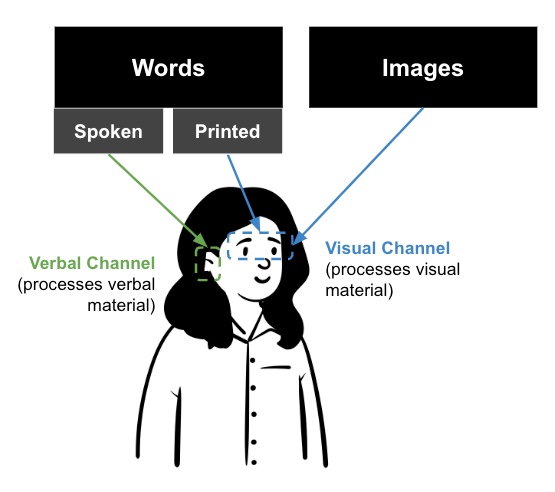
Dual channels: Humans have separate channels for processing visual and verbal material (Clark & Mayer, 2016, p. 35)
-
Printed words are processed by the visual channel and spoken words are processed by the verbal channel
-
Images are processed by the visual channel.
-
-
Limited capacity: Each channel can actively process only small amounts of information at one time which means there is limited capacity (Clark & Mayer, 2016, p. 35).
-
Active processing: Learning takes place when relevant cognitive processing occurs including: engaging with relevant material, organizing the material, and integrating it with previous knowledge (Clark & Mayer, 2016, p. 35).
What can we take away from this research and apply to our slide designs?
-
Be cognisant of how much information on each slide is being processed by the verbal and visual channels
-
Avoid overloading the verbal and visual channels with too much information at one time
-
Strategically combine words and images to foster meaningful learning (this is covered more in Topic 3)
Topic 2: Designing your presentation (the basics)
Have you ever viewed a presentation where the slides looked visually pleasing and effectively conveyed the information the presenter was sharing? Those slides likely utilized design principles to combine images, colours, and text in unique ways. Then, as a result, the slides were both visually pleasing and easy for the mind to comprehend.
There are four design principles that, when combined, can help you design your slides in effective ways- Contrast, Repetition, Alignment, and Proximity. As you may have noticed, it has an easy to remember acronym - CRAP!
Contrast
"If two items are not exactly the same, then make them different. Really different”
(Williams, 1994, p. 53)
If two elements (type, colour, size, line thickness, shape, space, etc.) are not the same, then make them very different so they contrast one another. This will help to create an organized hierarchy among the elements for your eye to follow (Williams, 1994, p. 53). However, be sure to use contrast sparingly and strategically to make certain elements stand out.
Contrast can be achieved by varying:
-
Text (large text with small text)
-
Colour (bold colours with neutral colours)
-
Shape (geometric/organic shapes with different geometric/organic shapes)
1. Text Contrast
When creating slides, be sure to choose a typeface that is clear and easy to read. Typefaces are categorized into two styles:
-
Sans serif typeface (e.g. Arial)
-
Serif typeface (e.g. Times New Roman). As you can see, this style has small “wings,” or serifs, at the end of the letters
When choosing a serif or sans serif typeface, research shows there is no difference in comprehension, reading speed, or preference (Weinschenk, 2020, p. 40). So, choose the one that best fits your purpose and is easy to read. Sans serif typefaces tend to be more casual while serif typefaces tend to be more formal.
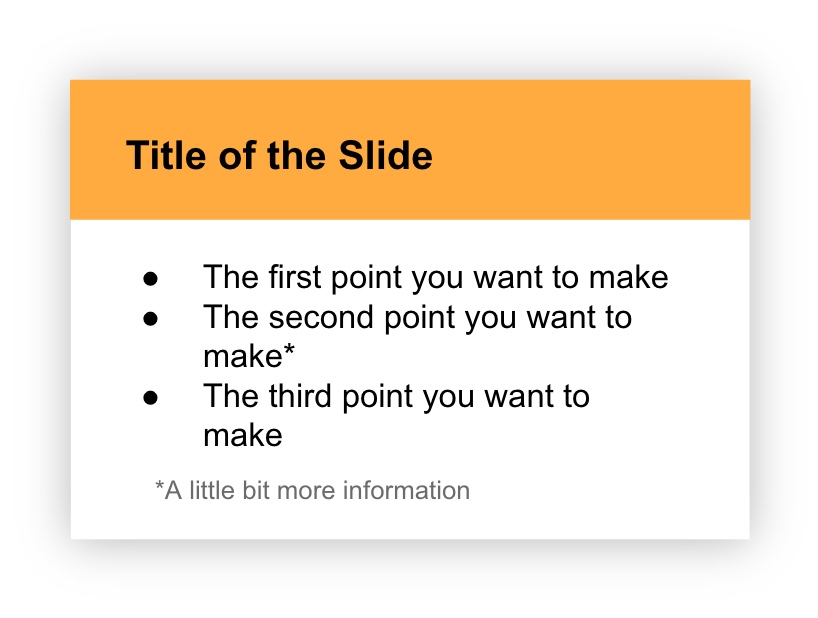
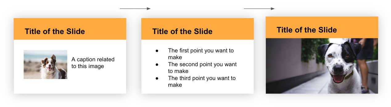
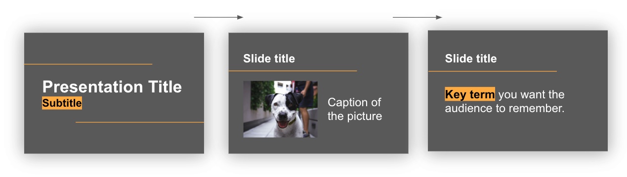
By contrasting large text with small text, an organizational hierarchy can be achieved (Williams, 1994, p. 53). This is exemplified in the example below. In the slide design, it feels most natural to begin at the top since that text is the largest and boldest. Providing large, bold titles on your slides helps organize information and focus the reader’s attention (Weinschenk, 2020, p. 37). Then, the eye continues traveling down and ends at the small text at the bottom which is likely the least important based on the visual hierarchy that is created. This intentional structuring of information signifies the importance of concepts and their relationship to one another. It allows students to scan the slide and get a sense of what the information is about, before even reading the material.
Did you know?
Using predetermined headings in PowerPoint automatically differentiates text
size which achieves the contrast principle while simultaneously making your
PowerPoint presentation more accessible for use with assistive technologies. Learn
more about this in Module 1: Formatting Course Content so it's Accessible.
2. Colour Contrast
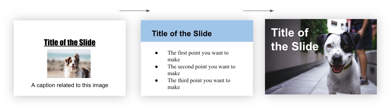
To strengthen contrast further, colour can be utilized as well. Using the same information as the slide example above, but integrating colour this time, you can see how it transforms the message. The organizational hierarchy now provides a stronger message about what to view first (the bold, colourful title) and what to view last (the small grey text at the bottom).
Sufficient Contrast
The colours used in your presentation should have sufficient contrast between the foreground text and slide background. Otherwise, students may have difficulty reading your material. WebAIM has a free, easy to use Contrast Checker to ensure there is sufficient contrast between your background and foreground colours.
Purposeful Selection
The use of colour should be purposefully chosen with your students' backgrounds in mind. For example, “Two people from different cultures can look at the same event and have very different reactions to it because of the meaning they attach to the event based on their deep culture. For example, in Eastern culture, the colour red means good luck while in most Western cultures red means danger” (Hammond, 2015, p. 23). Once suitable colours are chosen for your presentation, they should be consistently applied throughout your slides for a unified experience.
Convey Meaning in Multiple Ways
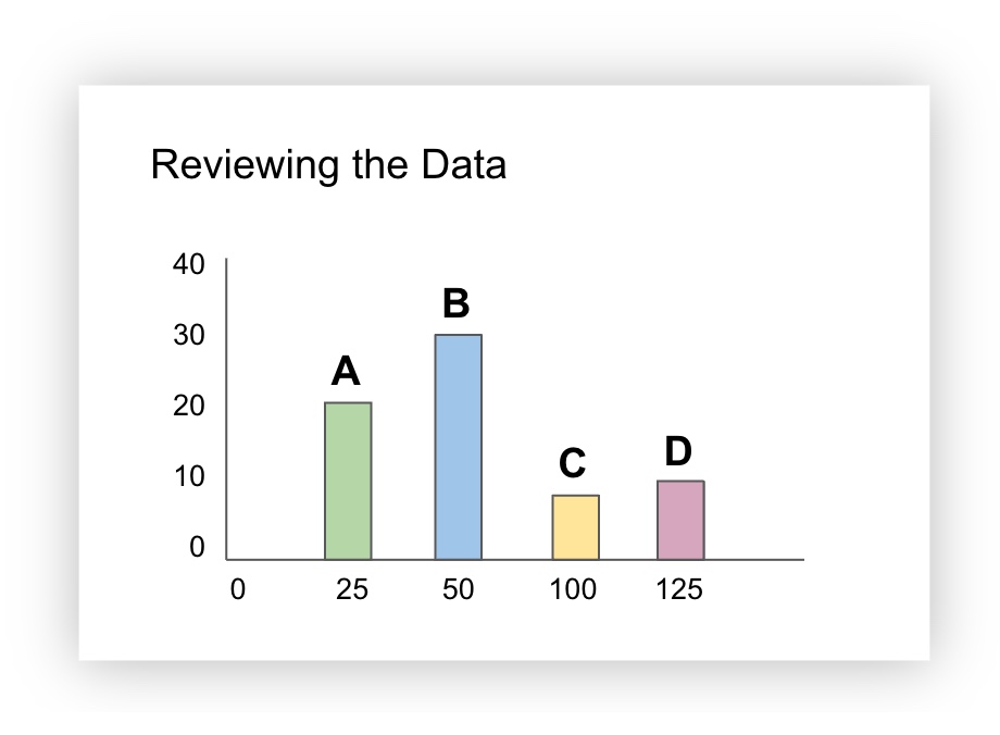
Lastly, did you know that 9% of men and 0.5% of women are colour-blind (Weinschenk, 2020, p. 25)? For that reason, colour alone should not be used to convey meaning. So, when designing your slides, be sure to provide an additional way to interpret the information that doesn’t rely only on colour.
For example, the slide below contains a bar graph and the bars are colour coded (green, blue, yellow, pink). Additional information (a letter) was added to help identify each of the bars. This way, if the green “A” bar and the yellow “C” bar were being discussed, all students would be able to identify the material being talked about, including those who cannot see the colours green or yellow.
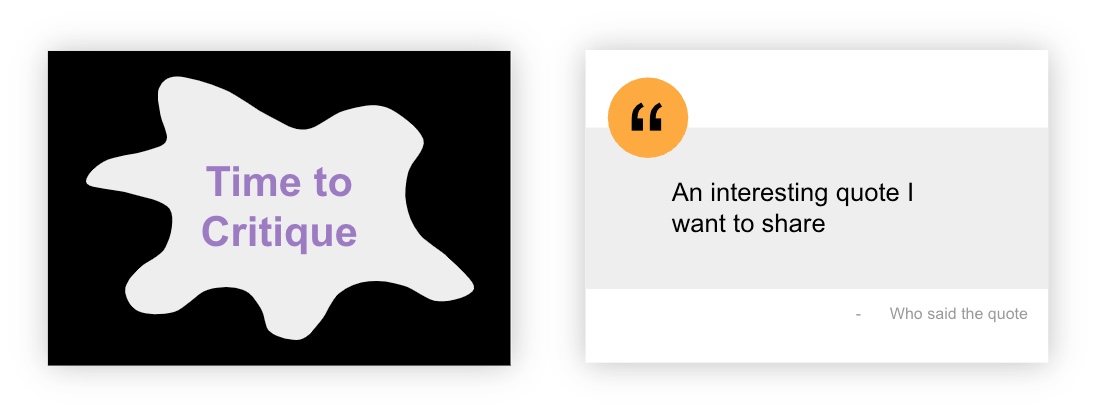
3. Shape Contrast
First of all, shapes can be classified as geometric or organic.
Geometric shapes have clear, defined edges that may be symmetrical (e.g. triangles, rectangles, circles, etc.)
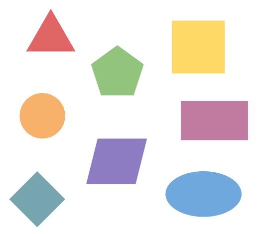
Organic shapes have more natural, flowing, irregular, or asymmetrical edges and often relate to things found in nature.

Geometric and organic shapes can be combined in interesting ways to create contrast and draw attention. For example, the slide on the left uses an organic shape to draw attention. The slide on the right uses geometric shapes, a circle and a rectangle, to highlight the quote that is being shared:
Contrast Activity
In the H5P activity below, drag the white vertical bar in the middle of the screen to the left and right to see two different slide designs - one that applies the text contrast principle and one that doesn't. Which slide design is more effective at conveying the message?
(Refresh your screen if the window below is displaying small)
Repetition
"Repeat visual elements of the design throughout the piece. You can repeat colour, shape, texture, spatial relationships, line thicknesses, sizes, etc.”
(Williams, 1994, p. 14)
To reinforce an idea in your presentation, and create a sense of continuity, you may need to repeat certain design elements (font, shapes, colours, etc.). By doing so, it creates a cohesive look and feel that implies all the slides belong together. In the following example, the font, colour, and heading style is consistently applied across the slides which makes them feel like they belong together.
In contrast, when design elements vary drastically from slide to slide, it creates a confusing and disjointed experience. In the following example, the font, colour, and heading style is inconsistently applied across the slides which makes them feel like they don’t belong together. Do you see and feel the difference?
Another way to think about repetition is consistency. In order to create a consistent and unified presentation, slide elements need to be strategically designed and repeated across all slides. In the following example, slide elements such as a horizontal line, use of highlighted words, and a feature colour of yellow are included throughout the slides in purposeful, consistent ways.
Repetition Activity
What elements on the following Agenda slide could be repeated across additional slides to create repetition? Click and drag each word into the spot that matches the corresponding slide design feature (the spots will appear when you start dragging a word).
(Refresh your screen if the window below is displaying small)
Alignment
“Nothing should be placed on the page arbitrarily. Every element should have some visual connection with another element on the page."
(Williams, 1994, p. 14)
Humans like to see order as it creates a calm, secure feeling (Williams, 1994, p. 35). Nothing should be arbitrarily placed on a slide without purposeful consideration. To create a sense of order in your slide design, three common types of alignment are:
-
Left
-
Center
-
Right
When designing PowerPoint slides, choose one alignment (left is most common) and use that consistently throughout the presentation for a unified look. However, contrasting alignment styles can result in interesting combinations when applied strategically!
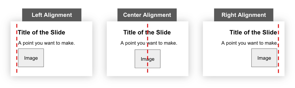
Further, when placing elements on a slide, ensure each one visually aligns with other items on the slide. For example, you may consider aligning the:
-
Top or bottom edges
-
Left or right edges
The examples below contain red dashed lines that are helpful to imagine when visually aligning elements on a slide.
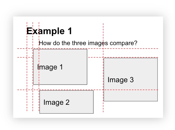
The following slide design has multiple elements that are not aligned which makes the slide feel chaotic:
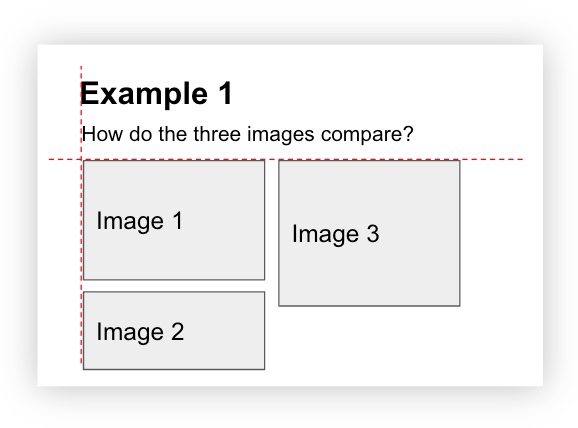
Now, by simply aligning the left and top edges of the elements, and creating consistent spacing between the images, this next slide feels much more cohesive and stable:
Grid
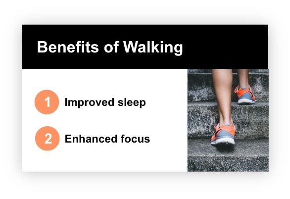
When organizing multiple elements on a slide, using a grid is helpful. A grid divides a slide into columns and rows, in equal or unequal sections, like the red dashed lines below. Then, the slide elements (titles, images, text, etc.) are designed to sit across these columns and rows in various combinations. Using a grid, like the one below, helps to organize your content in clear, defined areas which creates a sense of balance (Goring, 2022).
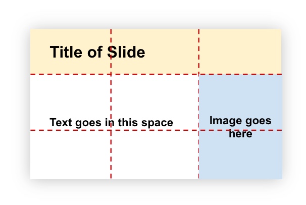
As an example of how a grid can transform into a slide design, the grid above was used to create the following slide:
Alignment Activity
Look at the slide below and think about where you would envision grid lines. Then, drag the white vertical bar to the right to make some dominant grid lines appear. Did they match the ones you were imagining?
(Refresh your screen if the window below is displaying small)
Proximity
“Items relating to each other should be grouped close together. When several items are close in proximity to each other, they become one visual unit rather than several separate units”
(Williams, 1994, p. 14)
Organization is the main purpose of proximity. Grouping similar elements implies a relationship between the items. Although we may group certain content in our minds, this grouping needs to be represented visually as well.
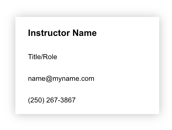
In the following slide, the information is all evenly spaced which doesn’t give us a sense of how the elements work together. Now, our brain must spend extra time and effort on determining how these elements relate to each other.
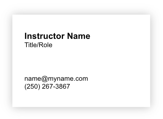
On the contrary, look what happens when we apply the principle of proximity in the slide below. By grouping related elements together, it immediately helps us understand the first two elements relate to information about the person and the last two elements relate to their contact information.
That being said, both proximity (closeness) and lack of proximity (lack of closeness) indicate a relationship so be sure to consider that in your design.
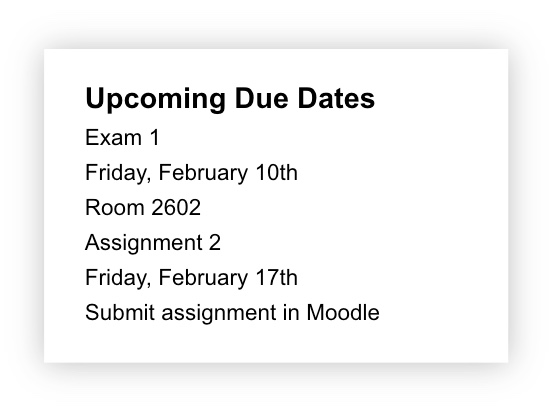
In the following image, there is no proximity or lack of proximity between any elements so it takes more mental processing to determine what information belongs together:
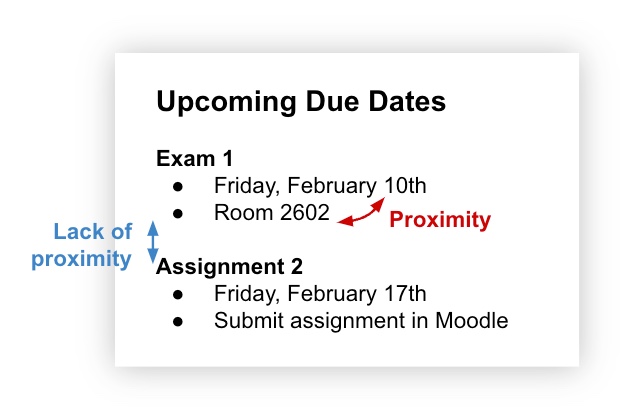
On the contrary, in the next image, there is:
-
proximity between the elements for each assignment, indicating they are related.
-
a lack of proximity between the two assignments, indicating they are not related.
Tip!
Don’t be afraid of white space (the blank space around text, images, etc. on a slide)! It gives our brain the necessary space to process and understand how elements on the slide relate or don’t relate to one another.
Proximity Activity
The following slide design doesn't follow the principle of proximity. Think about the changes you would make. Then, drag the white vertical bar to the left to reveal a new design that follows the principle of proximity.
(Refresh your screen if the window below is displaying small)
Topic 3: Designing your presentation to promote learning
Now that you have a better foundation of some key design principles to integrate into your slide designs, this section will explore the intersection of teaching and design, based on Richard Mayer’s Principles of Multimedia Learning. By considering how information is shared, through visual and/or verbal modalities, it helps you create and deliver presentations that are accessible to all.
Here is a brief summary of the principles that will be discussed:
-
The Coherence Principle: remove extraneous content
-
The Signaling Principle: Give students something to focus on
-
The Multimedia Principle: Use words and graphics together rather than words alone
-
The Redundancy Principle: Graphics and narration is more effective than including text as well
The Coherence Principle
“Adding extra material can hurt learning”
(Clark & Mayer, 2016, p.151)
People learn better when extraneous material is excluded. In other words, whatever is shared on each slide (images, text, narration) should directly support the learning goals.
Good practices to integrate into your slide design are:
-
Include simple images, text, and narration that directly relates to the learning goals
-
Remove any extraneous, decorative, or “fluff” material that may distract from learning
-
View your slides with a critical eye to reduce, simplify, and clarify, where possible
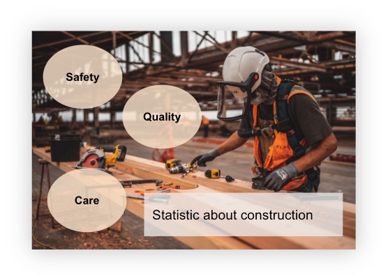
For example, let’s say an instructor wanted to share a statistic about construction and explain how that relates to job safety, quality, and care. The following slide is an attempt at sharing that message. However, since the slide contains a number of elements, it may distract from learning because it is not clear where to focus or what the overall message is. As the instructor is narrating, the student is left trying to figure out how all the slide elements relate to the overall message.
In the next slide, after applying the coherence principle and reducing, simplifying, and clarifying the message, it now contains only relevant elements that support learning. This way, the image and statistic can be used to pique student interest and the instructor can share the message about safety, quality, and care verbally. Now, the student is able to relate the slide elements with the message being shared more efficiently as there is less to focus on and figure out.

Here are a few questions to ask yourself when thinking about the content on your slides and how you will be delivering that content:
-
Do the elements on my slide help students comprehend the material? (DeBell, 2019)
-
Do the slide elements enhance the learning experience or distract from it?
-
Does my message about this slide use simple language to help the students understand? Or, is there an opportunity to trim down a few words to simplify the message? (DeBell, 2019)
The Signaling Principle
“People learn better when cues that highlight the organization of the essential material are added”
(Clark & Mayer, 2016, p. 108)
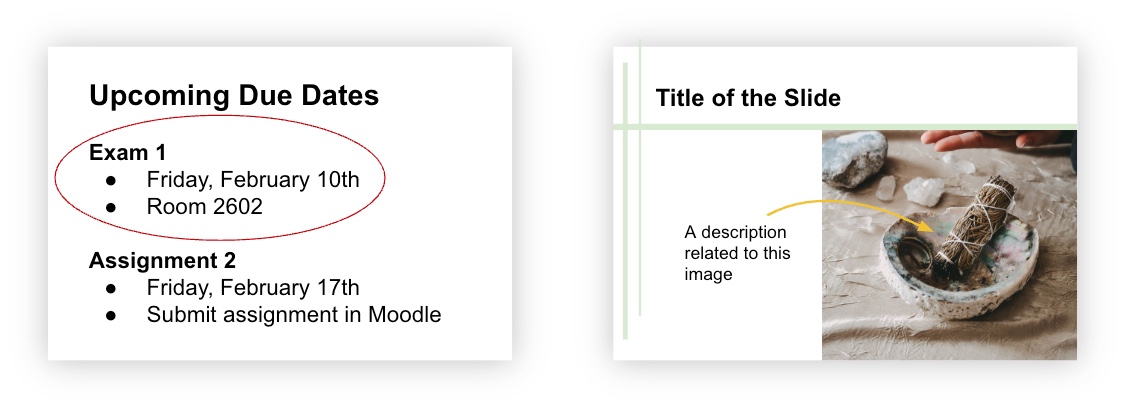
Students need to know what information to pay attention to, especially when multiple pieces of information are on the same slide. Adding cues that direct students to the relevant material provides a signal for how to process the information. Examples of cues include circling an element, highlighting certain words, or an arrow pointing to an element.
The example below illustrates how using cues immediately draws your attention to the important information on the slides:
Advance Organizers
Using advance organizers in your slides is another way to illustrate how information is organized. If you are unfamiliar with advance organizers, read the very short article, “Advance Organizers: Setting the Stage for Learning and Retention” by Temple University.
Using advance organizers provides a way for students to make connections between what they already know and what they are about to learn. They can be integrated within your slides to organize and structure your content, depending on your subject matter and how you teach it.
Move through the following Using Advance Organizers in Your Slides presentation that depicts different ways advance organizers can be used to structure your slides and move through your information in an organized way. How might you be able to use these modified advance organizers in your discipline?
Multimedia Principle
“Include both words and graphics”
(Clark & Mayer, 2016, p. 70)
Based on cognitive theory and research evidence, people learn better when words (spoken or printed) and pictures are included together, compared to just words alone.
Including both graphics and words encourages students to actively process the information - they are mentally representing the materials in words and pictures and are making connections between the verbal and visual representations. In contrast, for students who have less experience or expertise, using just words may reduce cognitive processing since they may find it difficult to connect the words with other knowledge (Clark & Mayer, 2016, p. 71).
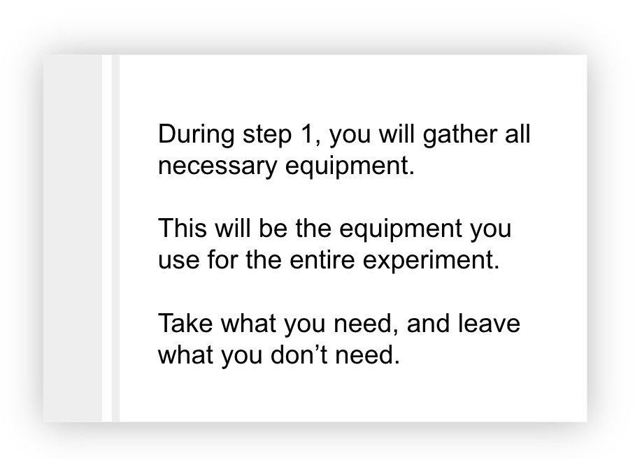
For example, let’s say an instructor wanted to go through the steps students need to perform in preparation for an experimentation. In their slide design below, it details the important information for step 1, related to gathering equipment for an experiment. However, by sharing only text, this may make it difficult for all students to fully process the expectation and know what equipment to gather.
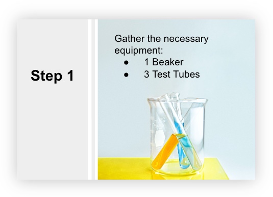
After considering the multimedia principle in the next slide, the text was reduced and enhanced to include only necessary information. Also, a carefully chosen graphic was added to illustrate what needs to be gathered. Now that the text and graphic directly support each other, students can associate the idea of gathering equipment with the graphic provided. Then, the additional information from the previous slide would be shared verbally to support the message being conveyed.
Now, what happens when we consider the idea of combining printed words, pictures, and spoken words, like we do in our slide presentations? The redundancy principle next will explain this further.
Redundancy Principle
“Explain visuals with words in audio or text but not both”
(Clark & Mayer, 2016, p. 131)
People learn better from graphics and narration rather than from graphics, narration, and on-screen text. This means avoid adding text to a graphic that is narrated (Clark & Mayer, 2016, p. 131). This way, the visual channel is not overloaded with both graphic and printed word information to process.
For example, let's say a student is presented with the following slide that contains text, a graphic, and is being narrated by the instructor. Play the audio clip to hear an example of what is happening in the student's visual and verbal channels:
So, what's the takeaway message here? If you are narrating a slide that contains graphics and text, this may be too much information to comprehend since students can only focus on limited things at one time. Instead, consider the redundancy principle and thoughtfully consider what text to include on each slide (if any) and what content you will be narrating.Now, the following slide has been redesigned to better consider the learning experience. Play the audio clip to hear an example of how a student may be processing the new slide design:
Using Text Purposefully
Text-based information may be helpful for a variety of students, including English language learners. However, presenting text on a slide while talking about it may not be the most effective way to get that message across, according to the redundancy principle. So, what are other ways that this text-based information can be shared with students? Examples include:-
Provide students with brief lecture notes pre or post lecture
-
Create close notes (a framework with guiding prompts that students fill in during the lecture)
-
Share a version of the slides that contain text-based information in the slide notes for students to review before or after the lecture
This way, students will be focused on listening to you talk rather than scribbling down what’s on the slide.
However, if some slides do need to contain a large amount of text, provide students with focused time to read the text before verbally elaborating on it. This way, students aren’t trying to do two things at one time.
Topic 3 Activity
It's time to test your recognition of the principles learned in Topic 3!
Conclusion
Presentations are often designed to tell a story about certain content in an interactive and captivating way. But, careful consideration is required when designing it. After this module, we hope you see how the design decisions you make when creating slides impact the overall learning experience.
In the end, the goal is to utilize design and multimedia principles to create presentations that are both visually appealing and consider the whole learning experience. By strategically providing information through visual and verbal modalities, this helps reduce barriers to learning as it ensures key information is equally recognizable to all learners (CAST, 2018).
Module 4 Assessment
To complete this Module as a component towards earning the certificate, please choose one of the assessment options below and share your response in the Module 4 Discussion Forum. We encourage you to engage with your colleagues and respond to their posts to learn about different approaches to slide design in different contexts.Assessment Option 1
Reflect on your existing PowerPoint lectures or presentation slides. Choose one that could be adjusted to enhance comprehension and learning. In your reflection, please:
- Describe the existing PowerPoint lecture or presentation slides
- Describe the revisions you would make to enhance learning (drawing from the module content)
- Explain why those revisions would be made. How does it impact students?
Assessment Option 2
- Describe how a PowerPoint lecture or presentation slides you use in your course already implements design strategies illustrated in this module
- Identify additional design strategies you would integrate into the slides, moving forward
- Describe how the current design strategies benefit students and why you would make additional changes.
Assessment Option 3
- How do you or might you use PowerPoint slides in your context?
- In general, how do the design strategies shared in this module apply to your context?
- To enhance learning in your setting, what design strategies do you currently integrate? What additional design strategies (learned about in this module) would you consider implementing?