Module 1 Book: Formatting Course Content so it's Accessible
| Site: | TRU Open Courses |
| Course: | Inclusive Digital Design Course (Enrolment Key: IDD) |
| Book: | Module 1 Book: Formatting Course Content so it's Accessible |
| Printed by: | Guest user |
| Date: | Tuesday, 14 July 2026, 1:01 AM |
Module 1 Overview
Learning Outcomes
By the end of this module, you will be able to:
-
Explain how accessible course content enhances the learning experience for all students
-
Describe design strategies for enhancing the accessibility of course content across digital formats
Topics
This module will cover the following topics:
-
Topic 1: What is Accessibility and Why Does it Matter?
-
Topic 2: Introduction to Assistive Technologies
-
Topic 3: Accessible Design Practices
-
Topic 4: Building and Checking for Accessibility Across Digital Formats
Introduction
Whether you are teaching in the classroom, online, or, more likely, some blend of the two, you are likely already in the habit of uploading some of your course content online for students to access. This may take the form of uploading documents such as Word files, PDFs, or PowerPoint slides, or authoring content directly in Moodle or on a webpage. It is easier than ever to make content available online and make that content media-rich and multimodal. The modern teacher is both a designer and a curator of content, deciding what content is included and how it is presented. Whether content is an original creation or an external resource that you have decided to include in your course, it is important to ensure that all students are able to access and engage with the material. This benefits all students, not just with those disabilities. Everyone benefits from well designed content.
This module will begin by discussing what we mean by accessibility and why it matters, and how the principles of Universal Design for Learning (UDL) serve as a useful underlying framework for designing for accessibility. We will then look at some common assistive technologies that students may be using in your courses to consider how the design of your content may impact compatibility with these devices. Finally, we will introduce some general accessible design principles, as well as how to build and check for accessibility within several common formats.
Topic 1 – What is Accessibility and Why Does it Matter?
Post-secondary institutions serve an increasingly diverse student population. Designing for accessibility refers to designing course materials in a way that is usable and understandable by all students, regardless of their abilities, cultural and linguistic backgrounds, or learning preferences. Learners will vary in:
-
Information processing
-
Language processing
-
Introversion and extroversion
-
Financial resources
-
Post-secondary readiness
-
Self-advocacy
-
Spatial ability
-
Reading speed
-
Mathematical calculations
(Takacs & Zhang, 2020, p. 17)
Designing for accessibility should be learner-centered. When we refer to accessibility we are referring to an inclusive practice of removing barriers that would prevent learners from interpreting your course materials and engaging with the learning experience. When planning how you will present your course content, start with your students in mind. Think of the “prototypical student” you would expect to encounter in one of your courses. Now think of students who don’t fit this prototype and the barriers they might encounter. How can you design your curriculum to anticipate barriers and “teach to the margins” to be as inclusive as possible?
Removing barriers to learning ensures that all students have equal access to educational opportunities and can fully participate in the learning experience, creating a more equitable and inclusive learning environment. This approach benefits all students, not just those with specific needs or disabilities, as it helps them engage and navigate with course content more effectively. Acting proactively to anticipate and address barriers by incorporating accessibility principles in the design phase can be time consuming up front but will save you time later by not needing to be as reactive to accommodation requests.
Looking Ahead
In Module 5 Book: Support Services Across Campus, we will look at various student supports and why integrating information about those services is an important practice.
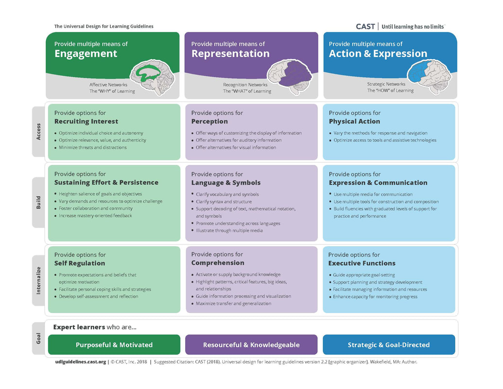
Universal Design for Learning (UDL) serves as a useful framework for this approach, particularly the principle of multiple means of representation. UDL is an educational framework that guides the design and delivery of inclusive and accessible learning experiences that meet the needs of all learners. The principles of UDL focus on providing multiple means of representation, expression, and engagement to accommodate the needs of diverse learners of varying abilities.
CAST. The UDL Guidelines. Retrieved from https://udlguidelines.cast.org/
UDL rejects a one-size-fits-all approach to teaching and learning, and instead emphasizes an approach to granting flexibility, choice, and access to all students (Pilgrim & Ward, 2017). It aims to meet the needs of diverse learners by designing the curriculum to adapt to the learner rather than forcing the learner to adapt to the curriculum. By designing accessible course materials with UDL principles in mind, educators can create learning experiences that are accessible, engaging, and effective for all students, regardless of their individual needs.
A deep dive into UDL is not within the scope of this course. You are encouraged to refer to the CAST UDL Guidelines for a more in-depth examination of the UDL framework.
Reflect
Before proceeding further, we invite you to consider the following three student personas.
Student 1
Levi is a third-year history student who lives on the fringe of the city limits. Her internet connection is not always reliable and has limited bandwidth that she must share with her two roommates. Levi uses public transportation and enjoys listening to podcasts on her commute to and from class.
Student 2
Amir is an international student in his first year of the Bachelor of Business Administration program. He is an English language learner, and although fluent, he sometimes struggles keeping up with lectures or other auditory components, especially if the presenter speaks quickly or uses frequent colloquialisms or slang. Amir is more comfortable digesting textual and visual content and is quite technology proficient.
Student 3
Charlotte is a second-year biology student who was born blind. She is comfortable using assistive technologies but becomes easily frustrated when images and charts are not recognized by her screen reader. She finds it disheartening to contact her instructors and the TRU accessibility office to request accommodation so frequently.
Instructions:
Reflect on how you have delivered course content in one or more of your courses recently. For example, this could include content uploaded in Moodle, on the web, through PowerPoint presentations, or other documentation. What kinds of barriers might each of these students face in accessing the content? Can you think of any ways that you could revise your content to be more accessible and inclusive for these students, while also being more engaging for all your students?
Topic 2: Introduction to Assistive Technologies
Your students may be using a variety of assistive technologies to access your course content. The term “assistive technologies” refers to, “Any item, piece of equipment, software program, or product system that is used to increase, maintain, or improve the functional capabilities of persons with disabilities” (Assistive Technology Learning Association). These technologies can range from relatively simple to quite complex tools.
Below you will find a brief overview of some of the types of assistive
technologies students may be using, and examples of each. You do not need to know the
details of how to operate each tool, but being aware of their purpose and basic
functionality will help you design your course content so it can be interpreted by
these technologies. In the next topic we will introduce some basic accessible design
practices you can implement into your content.
Zoom Text
This type of software allows users to magnify the content on their screen beyond the usual capacity of a computer. It is usually used in combination with text-to-speech software and is useful for learners with poor vision.
Can you think of any reason why your content could be problematic if it was enlarged considerably? How could you address this problem?
Examples: ZoomText
Text-to-Speech
As the name implies, text-to-speech software reads digital or print text aloud. This is useful for learners who have disabilities that affect their reading or attention, are English language learners, are visually impaired, or just simply want to listen to content instead.
Examples: Kurzweil 3000; TextAloud; built-in
functionality in Adobe PDF, Microsoft Word, Google
Chrome; Dragon Naturally Speaking (for speech-to-text)
Screen Readers
Screen readers are software that enables visually impaired users to interact with a digital interface with a speech synthesizer or braille display. Screen readers will read aloud content on the screen, including heading structures, tables, links, and images by reading alternative text.
Think how someone who could not view your content would experience it if it was read aloud. What sorts of structures or elements in your content could cause confusion?
Examples: Read&Write; NVDA; Jaws (Windows); VoiceOver (iOS devices)
Question to Consider
What assistive technologies are available at your institution?
(Adapted from Friedman, 2022)
Topic 3: Accessible Design Practices
In this topic we will dive into the nuts and bolts of creating accessible course content. By the end of this topic, you will leave with specific strategies that you can implement. Remember, proactively implementing these practices into your course content during the design phase will not only benefit all your students but will save you time later by not needing to be as reactive to accessibility requests. In the next topic we will explore how to implement these practices in specific platforms.
Organizing Your Course Content
A good general design principle for organizing your content is to “chunk” it into smaller segments. Breaking up long pieces of content and including opportunities to stop, reflect, and address questions will help promote comprehension and reduce cognitive load.
Tip!
You can also integrate UDL principles of providing options for comprehension into the organization of your content by activating or providing background knowledge, highlighting patterns, critical features, and relationships, guiding information processing, and maximizing transfer and generalization.
Headings
Course content should be well organized in logical sections using headings and sub-headings. This enables learners to identify the structure of your content more easily and how concepts are related, as well as quickly navigate through sections. Use concrete, specific language in your headings so learners know what to expect in that section. This benefits all learners, including sighted students and those with learning disabilities or diminished sight.
Headings should be hierarchical (nested) and sequential. Headings are numbered from 1 (highest level) to 6 (lowest level), but typically only the first three or four heading levels are used. Lower-level headings should operate as sub-headings of higher-level headings, and heading levels should not be skipped. Heading levels should be formatted consistently throughout your content so they are easily identifiable.
For example:
Heading 1
Text Related to heading 1 goes here.
Heading 2
This heading is a sub-heading of heading 1. Text related to heading 2 goes here.
Heading 3
This heading is a sub-heading of heading 2. Text related to heading 3 goes here.
Keep in mind that screen readers will not identify different font sizes, families, colours, or emphases as headings, even if they look like headings visually. As such, screen readers will be unable to navigate the content effectively unless headings are appropriately selected from the heading styles menu depending on the software you are using. In the next topic, we will discuss how to properly select headings on a variety of platforms.
Check Your Understanding
Teare, C. & Sparkes, C. Accessibility...One Step Closer. Licensed under a Creative Commons Attribution 4.0 International license. Retrieved from https://onestep.trubox.ca/accessibility-tour-elements-of-accessibility-headings/.
Images
According to the Principles of Multimedia Learning, people learn better from a combination of words and images than words alone (Mayer, 2009). To ensure that your content is accessible, it is important that images in your content can be interpreted by all learners. The UDL guideline for providing options for perception recommend presenting content in a way that doesn’t depend on a single sense, such as sight, by providing alternative ways of interpreting information or ways for learners to customize how information is displayed.
Using images to convey information can negatively impact a variety of learners if accessible practices are not included. The most obvious learners who may be impacted are those who are blind, have poor contrast vision, or cannot differentiate certain colours, but learners who rely on monochrome displays, printing content, have poor internet access, or have cognitive disabilities can also be impacted.
If your course content includes images, such as graphs, diagrams, or illustrations, you should first ask whether the images are decorative or serve a functional purpose. Decorative images are, you guessed it, for decorative or design purposes only. These may include banner images or groan-inducing memes. Decorative images are not necessarily a bad thing – they can be aesthetically pleasing or humorous - but they should be limited. Functional images are those that convey non-text information to students.
Once you determine whether the image is decorative or functional, decide how you will meet the accessibility needs of your students.
If your image is decorative, it may not necessarily need descriptive text. The alt text can read something like “decorative image” or be a brief description. You do not want to overload the learner with unnecessary information, but you also don’t want to leave the alt text blank, as a screen reader may read out the image URL instead.
If your image is functional, there are two primary accessibility considerations: the use of colour and the inclusion of descriptive text as an alternative way to convey information.
Images should not rely solely on colour to convey information, as information may be lost for learners who are not able to view the image or perceive the differences in colour. The easiest question to ask yourself when determining whether the colour in your image is accessible is, “Would learners still be able to perceive the information if the image was in black and white?” Strategies like using high contrast colours and adding additional context via text can help your colour images be more accessible. You will learn more about accessible practices surrounding the use of colour below.
Descriptive text provides a text description of an image should it not load or if it is being interpreted by a screen reader. It should describe what is being displayed and why it is important.
Following are three methods for adding descriptive text to functional images for students who may not be able to view them:
-
Alternative (alt) text: Alt text is an attribute within an image that displays when the image does not load or is read by a screen reader. Alt text should be less than 125 characters.
-
Description in surrounding text: If the alt text does not provide sufficient space to describe a complex image or diagram, consider putting the descriptive information in the surrounding text or a caption. Numbering the image, for example, “Figure 1,” can also make it easier to refer to. A shorter description can then be provided in the alt text. Ensure that the image is placed as closely as possible to the descriptive text.
-
Long text description: If the description of your image is too lengthy to reasonably fit in the surrounding text, link to a longer description. For complex diagrams or charts, you can provide the information in additional formats, such as lists, data tables, or a description of the data presented.
(Coolidge, Doner, Robertson, & Gray, 2018)
The figure below demonstrates providing relatively long text descriptions of a diagram in both a paragraph and list format. Which is easier to interpret?
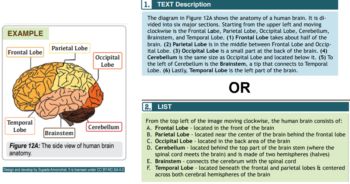
Brain Diagram with Accompanying Text Description in Paragraph Form (top) and List Form (bottom)
Adapted from Amornchat, Supada (n.d). Complex Images for All Learners. Licensed under CC BY-NC-SA 4.0. pcc.edu/accss.
Tip!
For strategies on how to make complex visuals such as graphs, tables, charts, and more accessible, see the following resource created by Supada Amornchat (CC BY-NC-SA 4.0): Complex Images for All Learners [PDF].
The following tips will help you write effective descriptive text:
-
Convey the content and functionality of the image, not just a literal description (e.g., “photo of cat”).
-
Try to keep your text descriptions succinct (one or two short sentences) that are an accurate and concise equivalent to the information in the image. You will need to provide longer descriptions for more complex images.
-
Leave out unnecessary information. For example, you do not need to include information like “image of…” or “photo of…”; assistive technologies will automatically identify the material as an image.
-
Avoid redundancy of content in your alternative description. Don’t repeat information that already appears in text adjacent to the image.
(Coolidge, Doner, Robertson, & Gray, 2018)
Check Your Understanding
Colour
Colour can be used effectively in your course content to make it more vibrant and convey or emphasize information; however, it should be used sparingly and with purpose. If not used with care, including colour in your content can be distracting or difficult
to interpret. This is especially problematic for students who are visually impaired, colour blind, have poor contrast vision, or are accessing materials through a monochrome display screen or by printing them.
Contrast
The first question you should ask yourself is whether there is sufficient colour contrast between foreground elements and background elements. Contrast refers to the “hue, lightness and saturation of text, images, and background” (Coolidge, Doner, Robertson, & Gray, 2018). Dark text on light backgrounds will be readable to most users, but some require the opposite. If including lighter text on a dark background, try bolding the text to improve readability.
Links should also be visually distinct from the background and surrounding text colour.
How do you know if your content has sufficient colour contrast to be accessible? The Web Content Accessibility Guidelines (WCAG 2.0) recommends that the “visual presentation of text and images of text has a contrast ratio of at least 7:1.” Large-scale text, decorative images, and logos should have a minimum contrast ratio of 4.5:1.
Here are a few tools recommended by the Accessibility Toolkit – 2nd Edition (2018) to help evaluate your contrast ratios:
-
Select Left ALT + Left SHIFT + Print Screen to check your content on your display screen in high contrast mode. Repeat this step to turn it off.
Using Colour to Convey Information
The second question you should ask yourself is whether colour is being used as the only means of conveying information. This could include charts or graphs, or the use of colour to highlight certain information. If so, some students may not be able to interpret the content. To test this, try changing your content to greyscale to see if it can still be interpreted. On Windows computers: select Start > Accessibility > Colour Filters > turn on the colour filter switch > select Greyscale.
To improve accessibility, try using strategies such as adding surrounding text with additional context (see Images above) or adding patterns and high contrast colours to coloured graphs or charts. You can also include text (e.g., “note:”) or symbols (e.g., add an asterisk) to indicate highlighted words since they won't be identified by screen readers.
For example, instead of only adjusting the font colour to indicate weeks that include a quiz, as shown here:
|
Week |
Topic |
|---|---|
|
1 |
Information Processing |
|
2 |
Lifespan Development |
|
3 |
Social Psychology |
|
4 |
Psychological Disorders |
Also include asterisks on weeks that include a quiz:
|
Week |
Topic |
|---|---|
|
1* |
Information Processing |
|
2 |
Lifespan Development |
|
3* |
Social Psychology |
|
4 |
Psychological Disorders |
To summarize, if you are still unsure whether the colour included in your course content is accessible, ask yourself the following questions:
|
Have you… |
Then be sure to… |
|---|---|
|
Presented content on a coloured or textured background? |
Include sufficient contrast between the foreground element and the background element |
|
Added links in your content? |
Confirm that the colour of your links is distinct from the colour of your background and surrounding text |
|
Used colour to convey information? |
Not solely rely on colour to convey information by adding additional ways for students to interpret |
(Adapted from Coolidge et al., 2018)
Check Your Understanding
Font
Choices of font and font size can be important considerations for learners who have reduced vision or those who have perceptual challenges. Clear, well-spaced text makes it much easier to interpret a document. Platforms like Moodle and WordPress have default paragraph sizes, but consideration should be given to font selection and font size when designing documents to be uploaded online. Recommended font size is between 10-14 to display well on a monitor. The Web Content Accessibility Guidelines (WCAG 2.0) recommends ensuring text can be zoomed to 200%.
A general design principal for typography is for headings to be one type of font (e.g. Sans Serif) and the body text to be the opposite (e.g. Serif). Selecting serif fonts is no longer considered problematic for display purposes, provided learners are using a relatively recent operating system and browser. Be consistent in font choices for all headings and all body text used throughout your document. This will make your document easier to interpret and more professional looking.
Use of Emphasis
The use of bold and italics should be used sparingly to draw attention to key concepts. Italics can be difficult to read online due to the resolution. Reserve using bold for emphasis and italics for the titles of works, terms that are being used abnormally, or when called for in your academic field.
Hyperlinks
Do you often consider how you add hyperlinks in your content? For example, if you were directing students to resources provided by TRU Accessibility Services, how would you do so out of the following three examples?
Example 1: You can access TRU Accessibility Services Resources at: https://www.tru.ca/current/academic-supports/as/resources.html.
Example 2: Click here to access resources from TRU Accessibility Services.
Example 3: Be sure to check out TRU Accessibility Services Resources for additional tools and tips.
Ensuring that hyperlinks contain meaningful context is critical for enhancing accessibility for students with a range of disabilities or challenges so as not to disorient the reader. Screen readers, for example, identify hyperlinks much like they do headings. A screen reader may identify a “link” and then read the visible linked text. Keep this in mind when creating links in your content, as screen readers will read out an entire URL that has been pasted. As a bonus, avoiding pasting long web addresses will make your document much cleaner and more professional!
Tip!
If a document is intended to be printed, then including the full web address would be beneficial.
Linking to text such as “click here” is an improvement, but still lacks necessary context, especially for those that are blind or hard of seeing. Instead, link to text that describes the purpose and destination of the link (e.g., website/article name), as well as any relevant formatting considerations (is it linking to a Word or PDF document?). If a link is set to open in a new tab or window, it is important to include this context in your link text as well to not disorient the reader; however, it is generally recommended to avoid doing this.
Check Your Understanding
Tables and Lists
Tables
Tables should be structured in a way that is easy to read and accessible to those who may have cognitive disabilities or those who are blind or have low vision using assistive technologies.
Screen readers read tables left to right, top to bottom, and one cell at a time. Including column headers and/or row headers will ensure that users of assistive technologies are oriented to where they are in the table by identifying the row and column, the header, and the information in that table cell. Screen readers also have difficulty reading complex tables, such as those with empty, merged, or split cells as the reading order can be disrupted, making the information provided in the table difficult to comprehend.
It can be tempting to use tables to help organize content, but tables are best reserved for:
-
Numerical data or data that can be described within a matrix layout efficiently
-
Providing visual organization to information in a condensed way
To summarize, here are some general best practices for making your tables more accessible:
-
Try to keep your tables simple or, when possible, use lists as an alternative or as an additional option. Ask yourself whether a table is necessary to best convey the information.
-
Ensure your table includes a clear caption title to help orient readers as to what information will be included.
-
Include column and/or row headers with the correct scope assigned.
-
Avoid blank or merged cells.
-
For lengthy tables, consider including an option for readers to skip passed the table.
-
The following resource by W3C provides an overview for formatting complex tables to maintain web accessibility: Tables Tutorial.
Lists
In order to be recognized by assistive technologies, lists should always be created by selecting the list tool in the editor of the software platform you are working in. For example, do not type "-" before each item. Although your content may visually look like a list, it will not be recognized as such. Screen readers are capable of recognizing nested lists, i.e., lists within lists.
Tip!
Adding content in both a table and list form can be great way to improve accessibility by providing the learner a choice in how to best interpret the content.
Review Activities
It’s time to practice! In the three activities below, you will be asked to identify elements of the provided course content that could be improved for accessibility, drawing on all of the accessible design practices from this topic.
Activity 1
Modified from The Human Population in Environmental
Biology by Matthew R. Fisher licensed under a Creative Commons Attribution
4.0 International License.
Activity 2
Modified from Atoms, Isotopes, Ions, and Molecules: The Building Blocks in
Biology 2e by Mary Ann Clark, Jung Choi, & Matthew Douglas licensed under a Creative Commons Attribution
4.0 International License.
Activity 3
Modified from Atoms, Isotopes, Ions, and Molecules: The Building Blocks in Biology 2e by Mary Ann Clark, Jung Choi, & Matthew Douglas licensed under a Creative Commons Attribution 4.0 International License.
Topic 4: Building and Checking for Accessibility Across Digital Formats
Implementing the accessible design practices described in the previous topic will function differently depending on the platform you are using to author content. This topic will describe the design considerations for different digital documents and web presences, including how to check for accessibility in each. Many platforms and software include built-in accessibility checkers. While useful, keep in mind that these checkers do not necessarily prove that your content is completely accessible for everyone, as they do not account for all types of learners and the challenges they might face. Do not neglect good design by relying on these accessibility checkers after your content is authored!
Note
Looking ahead to the assessment options at the end of this module, you may only want to focus on one or two formats that you use most often, but you are welcome to read through all if you have time.Moodle
Moodle is designed to be fully accessible, adhering to conformance standards. In other words, the Moodle interface and content uploaded through activities such as labels, pages etc. should be accessible to assistive technologies. That doesn’t mean, however, that measures don’t still need to be taken to
ensure that your content is accessible. This is especially relevant when uploading external files, such as Word or PDF documents. You will also need to ensure that images have alt text and videos include transcripts.
How to Make Accessible - A Checklist
Use the arrows to navigate between slides. We recommend expanding to full-screen view for better visibility.
How to Check Accessibility
Moodle has built-in functionality to check your content for accessibility. The Moodle editor includes two features for checking that your content is accessible: the Accessibility Checker and the Screenreader Helper. Note that these two features only check the current activity that you are creating, not your entire course in Moodle.
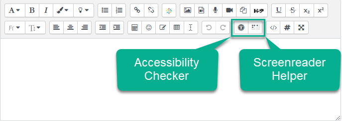
Accessibility Checker and Screenreader Helper in Moodle Editor
Selecting the Accessibility Checker will provide a short report identifying the following possible accessibility issues:
-
Images that are missing alt text, unless they have been identified as decorative
-
Insufficient colour contrast between foreground and background elements
-
Long blocks of text that are not structured with headings
-
Tables that are missing captions
-
Tables that include merged cells
-
Tables that are missing row or column headers
Selecting the Screenreader Helper icon provides a brief report with information relevant to screen reader users, including styles used (e.g., bold text), a list of hyperlinks, and images that are displayed as alt text.
Word
If authored with accessible design practices in mind, Word and other Microsoft Office products have powerful features to ensure that your content is accessible for all learners.
How to Make Accessible - A Checklist
Use the arrows to navigate between slides. We recommend expanding to full-screen view for better visibility.
How to Check Accessibility
Office 365 products, including Word, PowerPoint, Excel, and Outlook include built-in accessibility checkers. Simply select the Review tab and then “Check Accessibility.” This will open the Accessibility pane so you can review and fix any identified accessibility issues.
PowerPoint
If authored with accessible design practices in mind, PowerPoint and other Microsoft Office products have powerful features to ensure that your content is accessible for all learners.
How to Make Accessible - A Checklist
Use the arrows to navigate between slides. We recommend expanding to full-screen view for better visibility.
How to Check Accessibility
Similar to other Office 365 products, PowerPoint has a built-in accessibility to checker. Simply select the Review tab and then “Check Accessibility.” This will open the Accessibility pane so you can review and fix any identified accessibility issues.
PDFs
There are several ways to ensure your PDF file is accessible depending on whether it was created by converting an existing file, scanning a document, or created directly in Adobe Acrobat.
How to Make Accessible
Use the arrows to navigate between slides. We recommend expanding to full-screen view for better visibility.
How to Check Accessibility
Running the Accessibility Checker
Adobe Acrobat Pro has a built-in accessibility checker. To check your document for accessibility, select Tools and then Accessibility. A new accessibility toolbar will be displayed with the following options:
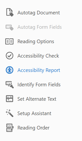
Adobe Acrobat Pro Accessibility Toolbar
Next, select “Accessibility Check” and follow these steps:
-
Check “Create accessibility report.”
-
From the “Category” drop-down menu, select “Document”
-
Select all checkbox options.
-
Select “Start Checking.”
-
The Accessibility Report Checker will appear in the left pane.
Further instructions for checking for accessibility depending on your version of Adobe can be found here:
Confirm Your Document Reading Order
Adobe includes a “read out loud” function that allows you to listen to your document as readers using a screen reader would experience. To access this, select “View,” then “Read out loud,” and finally “activate read out loud.”
WordPress (Web Pages)
The Web Content Accessibility Guidelines (WCAG) provide an international standard for web accessibility. If you are uploading course content to the web, such as through a WordPress site, these guidelines will help you ensure the technical requirements for making your web-based content accessible for all students, including those with disabilities.
The Web Content Accessibility Guidelines are based on four main principles:
-
Perceivable: Information and user interface components must be presentable to users in ways they can perceive. This means that content should be presented so that users can perceive it in different ways, or it is compatible with assistive technologies to transform it from one format to another.
-
Operable: User interface components and navigation must be operable. This means that users should be able to navigate your content in multiple ways, including only using a keyboard or voice commands. Users should have sufficient time to interact with your content, and navigation should be intuitive.
-
Understandable: Information and the operation of the user interface must be understandable. This means that your content is readable, and the layout and organization is consistent.
-
Robust: Content must be robust enough that it can be interpreted by a wide variety of user agents, including assistive technologies. This means you should strive to ensure your content is compatible with common current assistive technologies, and be positioned to adapt to future changes.
Did You Know?
You can create your own WordPress site through OpenETC!
How to Make Accessible
Interested in learning more about WordPress?
See Bonus Module Book: Using WordPress in Your Course (opens in a new tab)
The block editor is the default editor in WordPress. “Blocks” are content elements that can be added and arranged to create content layouts. There are blocks for paragraphs, headings, images, videos, headings, tables, and many more. Utilizing the accessibility design practices and selecting appropriate blocks will help ensure your WordPress web page is accessible.
Use the arrows to navigate between slides. We recommend expanding to full-screen view for better visibility.
How to Check Accessibility
WAVE is a free, online accessibility checker for web content. Simply paste a link to a web page to generate an accessibility report, or download a browser plugin for Chrome, Firefox, or Edge.
Module 1 Assessment
To complete this Module as a component towards earning the certificate, please choose one of the assessment options below and post your response in the Module 1 Discussion Forum. You are also encouraged to critically engage with others.
Assessment Option 1
Describe how a current resource (Moodle, Word, PowerPoint, Excel, etc.) you use in your course implements accessibility strategies discussed in this module and identify how additional accessibility strategies could be integrated moving forward (as applicable). Describe how/why the current accessibility strategies benefit students and how/why additional changes would make an impact (if applicable).
Assessment Option 2
Reflect on your course content. Choose one format (e.g., Moodle module, Word document, WordPress site) that could be adjusted to consider course content design principles to enhance accessibility.
-
Describe the current resource.
-
Describe revisions that would be made to enhance accessibility.
-
Explain why those decisions would be made.
Assessment Option 3
Why does accessibility matter in your context? Thinking about the stakeholders that you work with on a regular basis, what barriers might they encounter when trying to access content you produce?
-
Describe how you use any of the digital formats discussed in this module in your context.
-
What design principles do you currently use to enhance accessibility, and what additional revisions could you implement moving forward?