Module 1 Book: Formatting Course Content so it's Accessible
Images
According to the Principles of Multimedia Learning, people learn better from a combination of words and images than words alone (Mayer, 2009). To ensure that your content is accessible, it is important that images in your content can be interpreted by all learners. The UDL guideline for providing options for perception recommend presenting content in a way that doesn’t depend on a single sense, such as sight, by providing alternative ways of interpreting information or ways for learners to customize how information is displayed.
Using images to convey information can negatively impact a variety of learners if accessible practices are not included. The most obvious learners who may be impacted are those who are blind, have poor contrast vision, or cannot differentiate certain colours, but learners who rely on monochrome displays, printing content, have poor internet access, or have cognitive disabilities can also be impacted.
If your course content includes images, such as graphs, diagrams, or illustrations, you should first ask whether the images are decorative or serve a functional purpose. Decorative images are, you guessed it, for decorative or design purposes only. These may include banner images or groan-inducing memes. Decorative images are not necessarily a bad thing – they can be aesthetically pleasing or humorous - but they should be limited. Functional images are those that convey non-text information to students.
Once you determine whether the image is decorative or functional, decide how you will meet the accessibility needs of your students.
If your image is decorative, it may not necessarily need descriptive text. The alt text can read something like “decorative image” or be a brief description. You do not want to overload the learner with unnecessary information, but you also don’t want to leave the alt text blank, as a screen reader may read out the image URL instead.
If your image is functional, there are two primary accessibility considerations: the use of colour and the inclusion of descriptive text as an alternative way to convey information.
Images should not rely solely on colour to convey information, as information may be lost for learners who are not able to view the image or perceive the differences in colour. The easiest question to ask yourself when determining whether the colour in your image is accessible is, “Would learners still be able to perceive the information if the image was in black and white?” Strategies like using high contrast colours and adding additional context via text can help your colour images be more accessible. You will learn more about accessible practices surrounding the use of colour below.
Descriptive text provides a text description of an image should it not load or if it is being interpreted by a screen reader. It should describe what is being displayed and why it is important.
Following are three methods for adding descriptive text to functional images for students who may not be able to view them:
-
Alternative (alt) text: Alt text is an attribute within an image that displays when the image does not load or is read by a screen reader. Alt text should be less than 125 characters.
-
Description in surrounding text: If the alt text does not provide sufficient space to describe a complex image or diagram, consider putting the descriptive information in the surrounding text or a caption. Numbering the image, for example, “Figure 1,” can also make it easier to refer to. A shorter description can then be provided in the alt text. Ensure that the image is placed as closely as possible to the descriptive text.
-
Long text description: If the description of your image is too lengthy to reasonably fit in the surrounding text, link to a longer description. For complex diagrams or charts, you can provide the information in additional formats, such as lists, data tables, or a description of the data presented.
(Coolidge, Doner, Robertson, & Gray, 2018)
The figure below demonstrates providing relatively long text descriptions of a diagram in both a paragraph and list format. Which is easier to interpret?
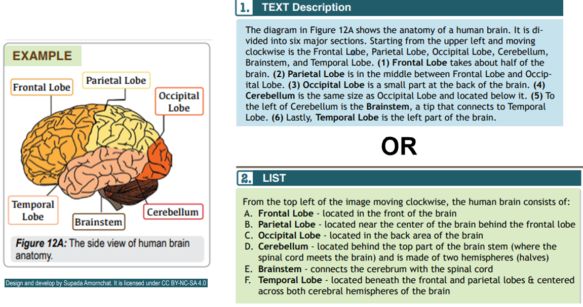
Brain Diagram with Accompanying Text Description in Paragraph Form (top) and List Form (bottom)
Adapted from Amornchat, Supada (n.d). Complex Images for All Learners. Licensed under CC BY-NC-SA 4.0. pcc.edu/accss.
Tip!
For strategies on how to make complex visuals such as graphs, tables, charts, and more accessible, see the following resource created by Supada Amornchat (CC BY-NC-SA 4.0): Complex Images for All Learners [PDF].
The following tips will help you write effective descriptive text:
-
Convey the content and functionality of the image, not just a literal description (e.g., “photo of cat”).
-
Try to keep your text descriptions succinct (one or two short sentences) that are an accurate and concise equivalent to the information in the image. You will need to provide longer descriptions for more complex images.
-
Leave out unnecessary information. For example, you do not need to include information like “image of…” or “photo of…”; assistive technologies will automatically identify the material as an image.
-
Avoid redundancy of content in your alternative description. Don’t repeat information that already appears in text adjacent to the image.
(Coolidge, Doner, Robertson, & Gray, 2018)
Check Your Understanding