Module 4 Book: Designing PowerPoint Presentations for All
Contrast
"If two items are not exactly the same, then make them different. Really different”
(Williams, 1994, p. 53)
If two elements (type, colour, size, line thickness, shape, space, etc.) are not the same, then make them very different so they contrast one another. This will help to create an organized hierarchy among the elements for your eye to follow (Williams, 1994, p. 53). However, be sure to use contrast sparingly and strategically to make certain elements stand out.
Contrast can be achieved by varying:
-
Text (large text with small text)
-
Colour (bold colours with neutral colours)
-
Shape (geometric/organic shapes with different geometric/organic shapes)
1. Text Contrast
When creating slides, be sure to choose a typeface that is clear and easy to read. Typefaces are categorized into two styles:
-
Sans serif typeface (e.g. Arial)
-
Serif typeface (e.g. Times New Roman). As you can see, this style has small “wings,” or serifs, at the end of the letters
When choosing a serif or sans serif typeface, research shows there is no difference in comprehension, reading speed, or preference (Weinschenk, 2020, p. 40). So, choose the one that best fits your purpose and is easy to read. Sans serif typefaces tend to be more casual while serif typefaces tend to be more formal.
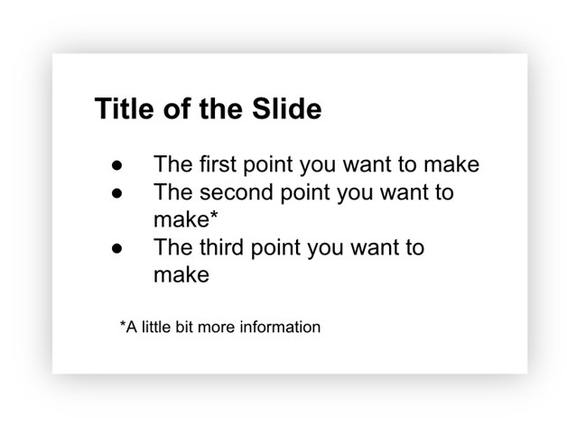
By contrasting large text with small text, an organizational hierarchy can be achieved (Williams, 1994, p. 53). This is exemplified in the example below. In the slide design, it feels most natural to begin at the top since that text is the largest and boldest. Providing large, bold titles on your slides helps organize information and focus the reader’s attention (Weinschenk, 2020, p. 37). Then, the eye continues traveling down and ends at the small text at the bottom which is likely the least important based on the visual hierarchy that is created. This intentional structuring of information signifies the importance of concepts and their relationship to one another. It allows students to scan the slide and get a sense of what the information is about, before even reading the material.
Did you know?
Using predetermined headings in PowerPoint automatically differentiates text
size which achieves the contrast principle while simultaneously making your
PowerPoint presentation more accessible for use with assistive technologies. Learn
more about this in Module 1: Formatting Course Content so it's Accessible.
2. Colour Contrast
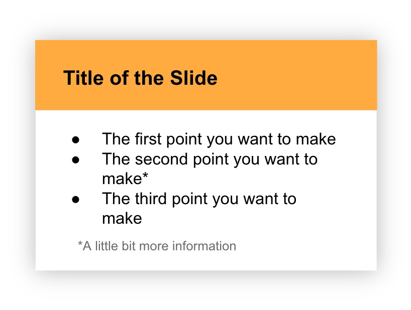
To strengthen contrast further, colour can be utilized as well. Using the same information as the slide example above, but integrating colour this time, you can see how it transforms the message. The organizational hierarchy now provides a stronger message about what to view first (the bold, colourful title) and what to view last (the small grey text at the bottom).
Sufficient Contrast
The colours used in your presentation should have sufficient contrast between the foreground text and slide background. Otherwise, students may have difficulty reading your material. WebAIM has a free, easy to use Contrast Checker to ensure there is sufficient contrast between your background and foreground colours.
Purposeful Selection
The use of colour should be purposefully chosen with your students' backgrounds in mind. For example, “Two people from different cultures can look at the same event and have very different reactions to it because of the meaning they attach to the event based on their deep culture. For example, in Eastern culture, the colour red means good luck while in most Western cultures red means danger” (Hammond, 2015, p. 23). Once suitable colours are chosen for your presentation, they should be consistently applied throughout your slides for a unified experience.
Convey Meaning in Multiple Ways
Lastly, did you know that 9% of men and 0.5% of women are colour-blind (Weinschenk, 2020, p. 25)? For that reason, colour alone should not be used to convey meaning. So, when designing your slides, be sure to provide an additional way to interpret the information that doesn’t rely only on colour.
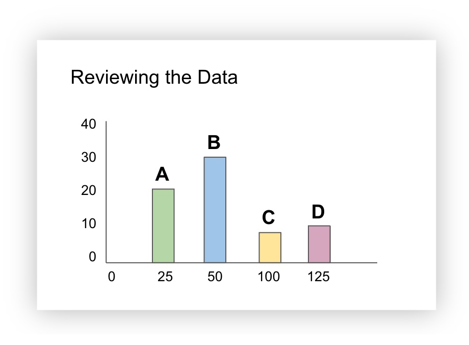
For example, the slide below contains a bar graph and the bars are colour coded (green, blue, yellow, pink). Additional information (a letter) was added to help identify each of the bars. This way, if the green “A” bar and the yellow “C” bar were being discussed, all students would be able to identify the material being talked about, including those who cannot see the colours green or yellow.
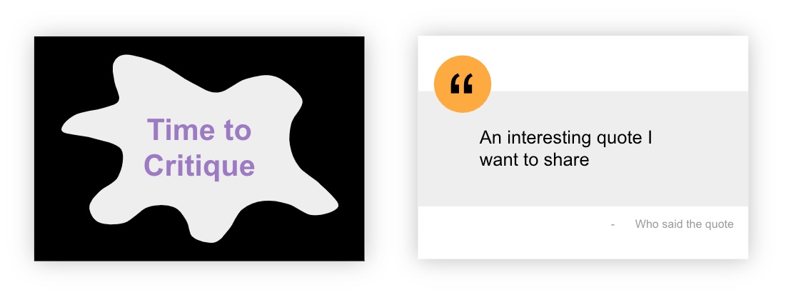
3. Shape Contrast
First of all, shapes can be classified as geometric or organic.
Geometric shapes have clear, defined edges that may be symmetrical (e.g. triangles, rectangles, circles, etc.)
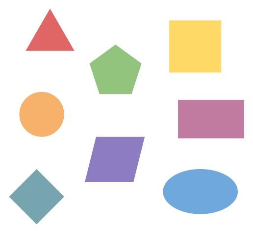
Organic shapes have more natural, flowing, irregular, or asymmetrical edges and often relate to things found in nature.

Geometric and organic shapes can be combined in interesting ways to create contrast and draw attention. For example, the slide on the left uses an organic shape to draw attention. The slide on the right uses geometric shapes, a circle and a rectangle, to highlight the quote that is being shared:
Contrast Activity
In the H5P activity below, drag the white vertical bar in the middle of the screen to the left and right to see two different slide designs - one that applies the text contrast principle and one that doesn't. Which slide design is more effective at conveying the message?
(Refresh your screen if the window below is displaying small)